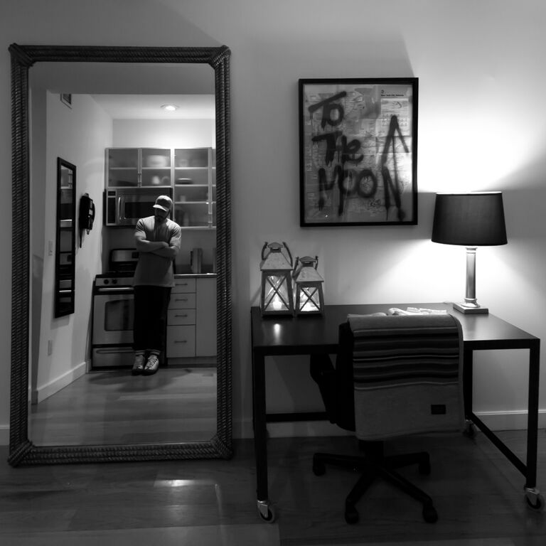
Gerard Adams is a friend of the family at Grungy Gentleman. He certainly has an entrepreneurial spirit that is contagious. We listen up because he speaks the truth and has a New York swagger that makes you buy in.
Read MoreSmoke & Mirrors | Thinking About Reflection
Jace Lipstein, The Grungy Gentleman | Grungy Digs
If mirrors surrounded us from every angle, would they ignite a personal transformation?
Read MoreHow Art Can Get You Past the First Kiss x Kent Youngstrom
She is currently at your door and trying not to stare while you fumble with the keys. You are fairly confident the apartment is clean and ready to impress. The Captain Morgan posters + sports pennants have been replace and upgraded to some real art for your walls. The long legged, short skirted beauty next to you is ready to make a decision. She is about to decide if you are the one, or are you the one that just couldn’t deliver. Your domain is about to score you major points. Is it comfortable and inviting? Is it cohesive and thought out - a sign to her that you would be able to keep all her chaos all together.
Your environment, and how you treat your walls, will go a long way toward shorting the distance between the living room and the bedroom.
Hanging art is the key to going all the way.
Just like the personality vibes you portray, your living space needs to be more than just a vessel for your random things. It needs to have an alluring, “I want to know more about you,” attraction. If you want your apartment to be a place where romance can blossom and take on volcanic eruptions of excitement and stimulation, art can be the aphrodisiac to start the fire.
So, how do you light the match?
Grab + hold her attention.
Art. Original art. The kind that grabs her like you want to but haven’t been given the chance to yet. The kind the wraps it’s fingers around her waist, spins her and glances in her eyes before pinning her to the wall and ever so slowly moves your lips to hers before breaking away and whispering in her ear that you have never seen anything like her. Choose art that fills the space and creates a a focal point for the room.
Big and bold is often better here.
Art creates a focal point Just like wearing a better fitting shirt to show off your primed bisceps makes her look at your arms, art points her eyes where you want them to go. Point the viewer in the direction you want them to look.
If you want to show your wild side, choose art with strong red tones. Yellows show your gentle side and can also evoke excitement in the opposite sex. Blues are relaxing and can open up avenues to new adventures. Greens stimulate creativity. Really there is no right or wrong choice in color - it is a personal decision.
Talk to her.
Let your furniture talk to your art and work things out.
Create vignettes of furniture, art and accessories. The art needs to bond with the other elements in your space and let them all work together in a more harmonious kumbayah kind of way. Copy staging techniques you find in furniture catalogs or on pinterest boards.
Find the sweet spot.
Pick a spot on the wall for the midsection of ALL of your art. Make that height 57” Yes, that is most likely lower than the spot you are used to. Currently your are reaching too high! Go ahead - ask her. She wants it lower and she wants it consistently. 57” is the standard average viewing height for everyone. Art galleries + museums swear by this rule. Galleries are not necessarily trying to impress a woman and make her comfortable, but they know how to get people in the door and have them return again and again. Think Nicole Kidman and Keith Urban hanging their various award plaques in their new Australian home. Should their first fight really be over the fact that Nicole’s eye height is higher than Keith’s?
The hanging recipe.
Measure artwork and divide by 2 (this gives you the center) [ ex. 24”]Measure top of your picture to the tightened wire or saw tooth hanger [ex. 4”]Subtract “tight wire” amount from 1/2 height amount for the “to the hook” amount. (this will tell you how far above 57” your hook should go) [12” – 4” = 8”] Add amount from above to 57” and mark on wall. nail goes here. [57” x 8” = 65” for nail/hook] If you are hanging a grouping of work, establish the 57” for the middle images and work your way out from there. Arranging the art on the floor first will help your process. Keep any large images in the grouping on the left, it will relax the eye.
kentyoungstrom.com | 704.533.1831 | @kentyoungstrom
We Don't Have to Follow the Pack... Grungy Gets Real
Most of us know what celebs are doing, what the style icons are copping, when those kicks are dropping, and so on... But are we flooded with so much fluff that we are completely out of touch with the fundamental structure at the root of life and culture as we know it? Are we so far from reality that we just expect those in front of us to chart our future?
Read More


